In this article, I’ll share some newbie explorations I’ve made in the areas of data analytics and pro hockey.
I recently embarked on a crazy journey into the world of data analytics. There’s nothing all that crazy about data analytics, mind you. It’s my journey that’s a bit odd.
You see, I’ve built myself a nice career in cloud and Linux administration, but I’m no developer. And, besides some obvious overlap, data is a whole universe apart from administration – a universe where programming on some level just can’t be avoided.
But parts of my work require me to closely follow the big developing trends in technology. And data is big. For years I’ve watched all the (un)cool kids playing around with the numbers that make the modern world work and, frankly, I’m jealous.
So here I go. I’m going to fumble my way through some very unfamiliar territory, make some dumb mistakes, and have fun. Want to join me?
This article won’t start with the absolute basic basics. If you’re still looking to take your first steps in Python, check this out. And if you want to know how to get started with a programming environment like the Jupyter notebooks I use, look over here. I’ll assume you’re already comfortable with all that.
Do Birthdays Matter in Sports?
I’ll begin with the question I’m going to try to answer:
Are you more likely to succeed as an elite athlete if your birthday happens to fall early in the calendar year?
It’s been claimed that youth sports that divide participants by age and set the yearly cut off at December 31 unwittingly make it harder for second-half-of-the-year players to succeed. That’s because they’ll be competing against players who are many months older.
At younger ages, those months can make a very big difference in physical strength, size, and coordination. If you were a minor league coach looking to invest in talent for a better team in a stronger league, who would you choose? And who would benefit over the long term from your extra attention?
This is where the well-known writer, thinker, (and fellow Canadian) Malcolm Gladwell comes in. Gladwell wasn’t actually the original source of this insight, although he’s the one most often associated with it.
Rather, those honors fall to the psychologist Roger Barnesly who noticed an oddly distributed birthdate pattern among players at an elite junior hockey game he was attending. Why were so many of those talented athletes born early in the year? Gladwell just mentioned Barnesly’s insight in his book Outliers, which was where I came across it.
But is all that true? Was Barnesly’s observation just an intriguing guess, or does real-world data bear him out?
Where Does the NHL Hide Its Data?
A couple of my kids are still teenagers so, for better or for worse, there’s no escaping the long shadow of hockey fandom in my house. To feed their bottomless appetites for such things, I discovered the existence of a robust official but undocumented API maintained by the National Hockey League. This URL:
https://statsapi.web.nhl.com/api/v1/teams/15/roster
…for instance, will produce a JSON-formatted dataset containing the official current roster of the Washington Capitals. Changing that 15 in the URL to, say, 10, would give you the same information about the Toronto Maple Leafs.
There are many, many such endpoints as part of the API. Many of those endpoints can, in addition, be modified using URL expansion syntax.
Fun fact: if you look at the site icon in the browser tab while on an NHL API-generated web page, you’ll see the Major League Baseball trademark. How did that happen?
How to Use Python to Scrape NHL Statistics
Knowing all that, I could scrape the endpoint for each team’s roster for each player’s ID number, and then use those IDs to query each player’s unique endpoint and read his birthdate. I could then extract the birth month from each NHL player into a Pandas DataFrame where the entire set could be computed and displayed as a histogram.
Here’s the code I wrote to make all that happen. I’m not going to discuss it in detail here, although that might happen sometime later.
import pandas as pd
import requests
import json
import matplotlib.pyplot as plt
import numpy as np

df3 = pd.DataFrame(columns=['months'])
for team_id in range(1, 11, 1):
    url = 'https://statsapi.web.nhl.com/api/v1/teams/{}/roster'.format(team_id)
    r = requests.get(url)
    roster_data = r.json()
    df = pd.json_normalize(roster_data['roster'])
    for index, row in df.iterrows():
        newrow = row['person.id']
        url = 'https://statsapi.web.nhl.com/api/v1/people/{}'.format(newrow)
        newerdata = requests.get(url)
        player_stats = newerdata.json()
        birthday = (player_stats['people'][0]['birthDate'])
        newmonth = int(birthday.split('-')[1])
        df3 = df3.append({'months': newmonth}, ignore_index=True)
df3.months.hist()
Before moving on, I should add a few notes:
- Be careful how and how often you use this code. There are nested for/loops, so running the script even once will hit the NHL’s API with more than a thousand queries. And that’s assuming everything goes the way it should. If you make a mistake, you could end up really annoying people you don’t want to annoy.
- This code (
for team_id in range(1, 11, 1):) actually only scrapes data from 11 of the NHL’s 30 teams. For some reason, certain API roster endpoints failed to respond to my queries and actually crashed the script. So, to get as much data as I could, I ran the script multiple times. This one was the first of those runs. If you want to try this yourself, remove thedf3 = pd.DataFrame(columns=['months'])line from subsequent iterations so you don’t inadvertently reset the value of your DataFrame to zero. - Once you’ve successfully scraped your data, use something like
df3.to_csv('player_data.csv')to copy your data to a CSV file, allowing you to further analyze the contents even if the original DataFrame is lost. It’s always good to avoid placing an unnecessary load on the API origin.
How to Visualize the Raw Data
Ok. Where was I? Right. I’ve got my data – the birth months of nearly 1,100 current NHL players – and I want to see what it looks like. Well wait no longer, here it is in all its glory:
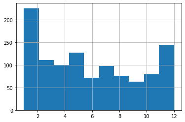
What have we got here? Looks to me like January births do, indeed, account for a disproportionately high number of players but, then, so do December births. And, overall, I just don’t see the pattern that Gladwell’s idea predicted. Aha! Shot down in flames. Never, ever trust an intellectual!
Err. Not so fast there, youngster. Are we sure we’re reading this histogram correctly? Remember: I’m just starting out in this field and learning on the “job.”
The default settings may not actually have given us what we thought they would. Note, for instance, how we’re measuring the frequency of births over 12 months, but there are only ten bars in the chart!
What’s going on here?
What Do Histograms Really Tell Us?
Let’s look at the actual numbers behind this histogram. You can get those numbers by loading the CSV file you might have earlier exported using df3.to_csv('player_data.csv'). Here’s how you might go about getting that done:
import pandas as pd
df = pd.read_csv('player_data.csv')
df['months'].value_counts()
And here’s what my output looked like (I added the column headers manually):
Month Frequecy
5     127
2     121
3     111
1     104
4      99
7      98
10     79
8      76
12     75
6      71
11     69
9      63
Looks like there were 127 births in May, 121 in February, and 111 in March. December had only 75.
Whoops. Sorry Malcolm. I should have had more faith. See how the five months with the highest birth frequencies are the first five months of the year? Now that’s exactly what Gladwell’s prediction would expect. So then what’s up with the histogram?
Let’s run it again, but this time, I’ll specify 12 bins rather than the default ten.
import pandas as pd
df = pd.read_csv('player_data.csv')
df.hist(column='months', bins=12);
A “bin” is actually an approximation of a statistically appropriate interval between sets of your data. Bins attempt to guess at the probability density function (PDF) that will best represent the values you’re actually using. But they may not display exactly the way you’d think – especially when you go with the defaults. Here’s what we’re shown using 12 bins:
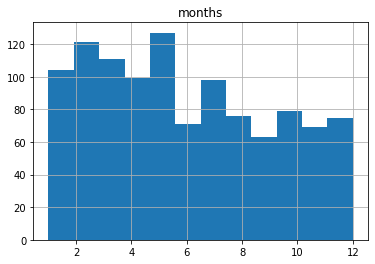
This one probably shows us an accurate representation of our data the way we’d expect to see it. I say “probably,” because there could be some idiosyncrasies with the way histograms divide their bins I’m not aware of.
Make Sure to Use the Right Tools For the Job
But it turns out that the humble histogram was actually the wrong visualization tool for our needs.
Histograms are great for showing frequency distributions by grouping data points together into bins. This can help us quickly visualize the state of a very large dataset where granular precision will get in the way. But it can be misleading for use-cases like ours.
Instead, let’s go with a plain old bar graph that incorporates the groupby and count arguments.
df.groupby('months').count().plot(kind='bar')Running that will give us something a bit easier to read that’s also more intuitively reliable:
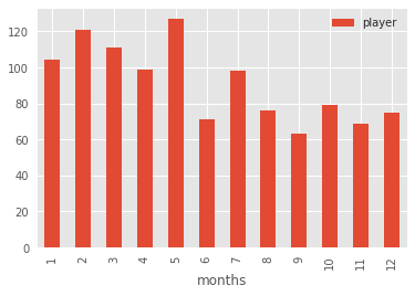
That’s better, no? We can see that the five months with the highest birth month frequencies are at the start of the year.
The moral of the story? Data is good. Histograms are good. But it’s also good to know how to read them and when to use them.
There’s much more administration goodness in the form of books, courses, and articles available at my site: bootstrap-it.com.