Sometimes it can be somehow comforting to reflect on how much worse everything is now than it was in the good old days.
“Kids have no respect.”
“Everything costs way too much.”
“Public officials don’t inspire trust.”
“And what about the weather? We never used to get so many devastating hurricanes, did we?”
Well I’m old enough to have been around the block a few times and I’m not sure. I wasn’t exactly angelic as a child, things always cost more than we wanted them to, and public officials were never the most loved creatures on the planet. But major storms? I haven’t a clue.
It turns out that there’s a lot of excellent storm data out there, so there’s no reason why we shouldn’t at least search for some clues. And my attempts to add data analytics to my existing stock of professional tools might help, here.
First, though, we should carefully define some terms and fill in some background details.
What Is a Major Storm?
Hurricanes – or, more accurately, tropical cyclones – are “tropical” in the sense that they form over oceans within tropical regions. The term “tropics” refers to the area of the earth’s surface that falls within 23 degrees (or so) of the equator, to both its north and south.
The storms are called “cyclones” because the movement of their winds is cyclical (clockwise in the Southern Hemisphere and counterclockwise in the Northern Hemisphere).
Cyclones are fed by evaporated ocean water and leave torrential and often violent thunderstorms in their wake – especially after drifting over habited land areas.
In broad terms, a storm producing sustained winds of between around 34 and 63 knots (or between 39 and 72 miles per hour) is considered a tropical storm. Storms with winds above 64 knots (73 mph) are hurricanes (or, in the Western Pacific or North Indian Oceans, typhoons).
Hurricanes are measured by categories between one and five, where category five hurricanes are the most violent and dangerous.
Where Does Major Storm Data Come From?
Reliable and largely consistent historical storm data exists, at least in the US, for the past century and a half. But properly understanding the context of that data will require some knowledge of how those observations were made over the years.
Until the 1940’s, most observations were made by the crews of ocean-going ships. But ship’s crews can only observe and report what they see, and what they see will be determined by where they go.
Before the opening of the Panama Canal in 1914, ships traveling between Europe and the Pacific ocean would follow a route around the southern tip of South America that largely missed US coastal areas. As a result, it’s likely that a significant percentage of weather events were simply missed.
Similarly, the advent of aircraft reconnaissance in the 1940s would have allowed scientists to catch more events that would have earlier been missed. And the use of weather satellites from the 1960s on has allowed us to catch just about all ocean activity.
These changes, and their impact on storm data, are neatly summarized on this page from the US government National Oceanic and Atmospheric Administration (NOAA) site, based on a data analysis study performed for the Geophysical Fluid Dynamics Laboratory (GFDL).
What Does the Historical Record Show?
So after all that background, what does the data actually say? Are serious hurricanes more common now than in the past? Well, according to the NOAA website, the answer is: “No.” Here’s how they put it:
“Atlantic tropical storms lasting more than 2 days have not increased in number. Storms lasting less than two days have increased sharply, but this is likely due to better observations…We are unaware of a climate change signal that would result in an increase of only the shortest duration storms, while such an increase is qualitatively consistent with what one would expect from improvements with observational practices.”
You’ll get the whole story, including a nice explanation for the data manipulation choices they made, by reading the study itself. In fact, I encourage you to read that study, because it’s a great example of how the professionals approach data problems.
From here on in, however, you’ll be stuck with my amateur and simplified attempts to visualize the raw, unadjusted data record.
US Hurricane Data: 1851-2019
Our source for “Continental United States Hurricane Impacts/Landfalls” data is this NOAA webpage.
To download the data, I simply copied it by clicking my mouse at the top left (the “Year” heading field) and dragging all the way down to the bottom-right. I then pasted it into a plain-text editor on my local computer and saved it to a file with the extension .csv.
How to Clean Up the Hurricane Data
If you quickly look through the webpage itself you’ll see some formatting that’ll need cleaning up. Each decade is introduced with a single row containing nothing but a string looking like: 1850s. We’ll want to just drop those rows. Years with no events contain the string none in the second column. Those, too, will need to go.
There are some events that apparently have no data for their Max Wind speeds. Instead of a number (measured in knots), the speed values for those events are represented by five dashes (-----). We’ll have to convert that to something we can work with.
And finally, while months are generally represented by three-letter abbreviations, there were a couple of events that stretched across two months. So we’ll be able to properly process those, I’ll therefore convert Sp-Oc and Jl-Au to Sep and Jul respectively.
The fact is that we won’t actually be using the month column, so this won’t really make any difference. But it’s a good tool to know.
Here’s how we set things up in Jupyter:
import pandas as pd
import matplotlib as plt
import matplotlib.pyplot as plt
import numpy as np

df = pd.read_csv('all-us-hurricanes-noaa.csv')
Let’s look at the data types for each column. We can ignore the strings in the States and Name column – we’re not interested in those anyway. But we will need to do something with the date and Max Wind columns – they won’t do us any good as object.
df.dtypes

Year                                         object
Month                                        object
States Affected and Category by States       object
Highest\nSaffir-\nSimpson\nU.S. Category    float64
Central Pressure\n(mb)                      float64
Max Wind\n(kt)                               object
Name                                         object
dtype: object
So I’ll filter all rows in the Year column for the letter s and simply drop them (== False). That will take care of all the decade headers (that is, those rows containing an s as part of something like 1850s).
I’ll similarly drop rows containing the string None in the Month column to eliminate years without storm events.
While quiet years could have some impact on our visualizations, I suspect that including them with some kind of null value would probably skew things even more the other way. They’d also greatly complicate our visualizations.
Finally, I’ll replace those two multi-month rows.
df = df[(df.Year.str.contains("s")) == False]
df = df[(df.Month.str.contains("None")) == False]
df = df.replace('Sp-Oc','Sep')
df = df.replace('Jl-Au','Jul')
Next, I’ll use the handy Pandas to-datetime method to convert the three-letter month abbreviations to numbers between 1 and 12. The format code %b is one of Python’s legal date-related designations and tells Python that we’re working with a three-letter abbreviation. For the full list, see this page.
df.Month = pd.to_datetime(df.Month, format='%b').dt.month
I’d like to tighten up the headers a bit so they’re a little easier to both read and reference in our code. df.columns will change all column header values to the list I specify here:
df.columns =['Year', 'Month', 'States', 'Category',
             'Pressure', 'Max Wind', 'Name']
I’ll have to convert the Year data from string objects to integers, or Python won’t know how to work with them appropriately. That’s done using astype.
As advertised, I’ll also convert the null (-----) values in Max Wind to NaN – which NumPy will read as “not a number.” I’ll then convert the data in Max Wind from object to float.
df = df.astype({'Year': 'int'})
df = df.replace('-----',np.NaN)
df = df.astype({'Max Wind': 'float'})
Let’s see how all that looks now:
df.dtypes

Year          int64
Month         int64
States       object
Category    float64
Pressure    float64
Max Wind    float64
Name         object
dtype: object
Much better.
How to Present the Hurricane Data
Now, looking at our data, I’m going to suggest that we break out the three metrics: hurricane category, barometric pressure, and maximum wind speeds.
My thinking is that there’s little to gain from the added complication by lumping them together, and we risk losing sight of important differences between incidents of lighter and more serious storms.
Of course, I can always isolate individual metrics to see what their distributions would look like. Using value_counts against the Category column, for instance, shows me that the lighter category 1 and 2 hurricanes are far more frequent than the more dangerous events.
df['Category'].value_counts()

1.0    121
2.0     83
3.0     62
4.0     25
5.0      4
Name: Category, dtype: int64
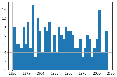
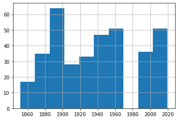
And plotting a single histogram of the complete data set does give us a nice overview of the number of events (represented on the y-axis) through history, but we might be losing some of the finer details in the process.
From this histogram, it’s obvious that there’s been no noticeable change in storm frequency over time. To be sure that my choice of the number of bins we’re using isn’t unintentionally masking important trends, experiment with other values besides 25.
df.hist(column='Year', bins=25)
But to allow us to focus on each metric, I’ll plot three separate graphs. To do that, I’ll create three new dataframes and populate each one with the contents of the Year column and the respective data column.
df_category = df[['Year','Category']]
df_wind = df[['Year','Max Wind']]
df_pressure = df[['Year','Pressure']]
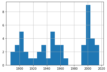
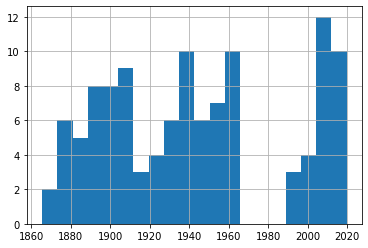
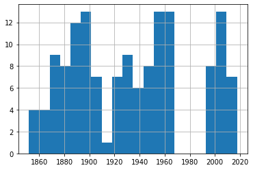
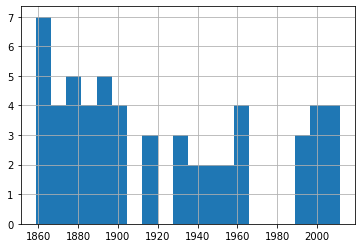
Sending each of those dataframes straight to a plot will miss the point, because it won’t distinguish between the severity of storms. So I’ll show you how we can break out the data by category (1-5). This for loop will iterate through the numbers 1-6 (which is “Python” for returning the numbers between 1 and 5) and uses each of those numbers in turn to search for hurricanes of that category.
Rows whose category matches the number will be written to a new (temporary) dataframe called df1 which will, in turn, be used to plot a histogram. The plt.title line applies a title for the printed graph that will include the category number (the current value of converted_num).
The loop will work through the process five times, each time writing the number of events the current category to df1. All five histograms will be printed, one after the other.
for x in range(1, 6):
    cat_num = x
    converted_num = str(cat_num)
    dfcat = df_category['Category']==(x)
    df1 = df_category[dfcat]
    df1.hist(column='Year', bins=20)
    plt.title("Total Category " + (converted_num) + " Events")
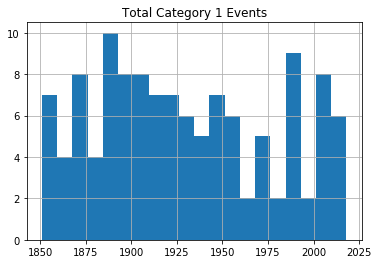
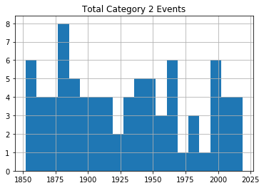
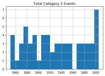
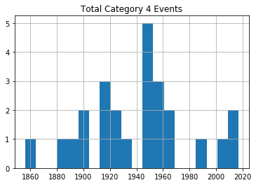
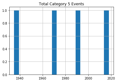
As you can see, there’s no noticeable evidence of significantly rising storm frequency over time.
As always, scan your data (using tools like value_counts()) to confirm that the plots make sense in the real world.
US Tropical Storm Data: 1851-1965, 1983-2019
Hurricanes (or cyclones) are, of course, only one part of the story. A rise in the frequency of destructive tropical storms would also be cause for concern.
Fortunately, NOAA makes relevant data available in much the same format as their hurricane data. Here’s the webpage where you’ll find the chart. Copy the data into a .csv file the same way as before.
Note, however, how there’s no data for the years 1966-1982. Don’t ask me why. There just isn’t. Funny thing, weather.
I would create a new Jupyter notebook for this part of the project, as there’s nothing we’ll need from the hurricane version. Therefore, you’ll set things up as always:
import pandas as pd
import matplotlib as plt
import numpy as np
df = pd.read_csv('all-us-tropical-storms-noaa.csv')
Let’s Clean Up the Tropical Storm Data
The rows representing years without events should, again, be removed:
df = df[(df.Date.str.contains("None")) == False]
The Date column in this dataset has characters pointing to five footnotes: $, *, #, %, and &. The footnotes contain important information, but those characters will give us grief if we don’t remove them.
These commands will get that done, replacing all such strings in the Date column with nothing:
df['Date'] = df.Date.str.replace('\$', '')
df['Date'] = df.Date.str.replace('\*', '')
df['Date'] = df.Date.str.replace('\#', '')
df['Date'] = df.Date.str.replace('\%', '')
df['Date'] = df.Date.str.replace('\&', '')
Next, I’ll reset the column headers. First, because it will be easier to work with nice, short names. But primarily because, as a Linux sysadmin, I find spaces in filenames or headings morally offensive.
df.columns =['Storm#', 'Date', 'Time', 'Lat', 'Lon',
             'MaxWinds', 'LandfallState', 'StormName']
The column data types are going to need some work:
df.dtypes

Storm#            object
Date              object
Time              object
Lat               object
Lon               object
MaxWinds         float64
LandfallState     object
StormName         object
dtype: object
Let’s see what our data looks like:
df.head()

Storm#	Date		Time	Lat	Lon	MaxWindsLandfallState	StormName
6	10/19/1851	1500Z	41.1N	71.7W	50.0	NY	NaN
3	8/19/1856	1100Z	34.8	76.4	50.0	NC	NaN
4	9/30/1857	1000Z	25.8	97	50.0	TX	NaN
3	9/14/1858	1500Z	27.6	82.7	60.0	FL	NaN
3	9/16/1858	0300Z	35.2	75.2	50.0	NC	NaN
I’m actually not sure what those Storm # values are all about, but they’re not hurting anyone. The dates are formatted much better than they were for the hurricane data. But I will need to convert them to a new format. Let’s do it right and go with datetime.
df.Date = pd.to_datetime(df.Date)
How to Present the Tropical Storm Data
For our purposes, the only data column that really matters is MaxWinds – as that is what defines the intensity of the storm. This command will create a new dataframe made up of the Date and MaxWinds columns:
df1 = df[['Date','MaxWinds']]
No reason to push this off: we might as well fire up a histogram right away. You’ll immediately see the gap around 1970 where there was no data. You’ll also see that, again, there doesn’t seem to be much of an upward trend.
df1['Date'].hist()
But we really should drill down a bit deeper here. After all, this data just mixes together 30 knot with 75 knot storms. We’ll definitely want to know whether or not they’re happening at similar rates.
Let’s find out how many rows of data we’ve got. shape tells us that we’ve got 362 events altogether.
print(df1.shape)

(362, 2)
Printing our dataframe shows us that the MaxWinds values are all multiples of 5. If you scan the data for yourself, you’ll see that they range between 30 and 70 or so.
df1

	Date		MaxWinds
1	1851-10-19	50.0
6	1856-08-19	50.0
7	1857-09-30	50.0
8	1858-09-14	60.0
9	1858-09-16	50.0
...	...	...
391	2017-09-27	45.0
392	2018-05-28	40.0
393	2018-09-03	45.0
394	2018-09-03	45.0
395	2019-09-17	40.0
362 rows × 2 columns
So let’s divide our data into four smaller sets as reasonable proxies for storms of various levels of intensity. I’ve created four dataframes and populated them with events falling in their narrower ranges (that is between 30 and 39 knots, 40 and 49, 50 and 59, and 60 and 79). This should give us a reasonable frame of reference for our events.
df_30 = df1[df1['MaxWinds'].between(30, 39)]
df_40 = df1[df1['MaxWinds'].between(40, 49)]
df_50 = df1[df1['MaxWinds'].between(50, 59)]
df_60 = df1[df1['MaxWinds'].between(60, 79)]
Let’s confirm that the cut-off points we’ve chosen make sense. This code will attractively print the number of rows in the index of each of our four dataforms.
st1 = len(df_30.index)
print('The number of storms between 30 and 39: ', st1)
st2 = len(df_40.index)
print('The number of storms between 40 and 49: ', st2)
st3 = len(df_50.index)
print('The number of storms between 50 and 59: ', st3)
st4 = len(df_60.index)
print('The number of storms between 60 and 79: ', st4)

The number of storms between 30 and 39:  51
The number of storms between 40 and 49:  113
The number of storms between 50 and 59:  142
The number of storms between 60 and 79:  56
There probably is an elegant way to combine those four commands into one. But my philosophy is that syntax that would take me an hour to figure out will never outweigh the simplicity of five seconds of cutting and pasting. Ever.
We could also look just a bit deeper into the data using our old friend, value_counts(). This will show us that there were 71 40 knot events and 42 45 knot events throughout our time range.
df_40['MaxWinds'].value_counts()

40.0    71
45.0    42
Name: MaxWinds, dtype: int64
We can plot a single line graph to display all four of our subsets together. This plot adds axis and plot labels and a legend to make the data easier to understand. The subplot(111) value controls the size of the figure.
import matplotlib.pyplot as plt
fig = plt.figure()
ax = plt.subplot(111)
df_30['MaxWinds'].plot(ax=ax, label='df_30')
df_40['MaxWinds'].plot(ax=ax, label='df_40')
df_50['MaxWinds'].plot(ax=ax, label='df_50')
df_60['MaxWinds'].plot(ax=ax, label='df_60')
ax.set_ylabel('Wind Speed In Knots')
ax.set_xlabel('Time Between 1851 and 2019')
plt.title('Tropical Storms by Maximum Wind Speeds (knots)')
ax.legend()
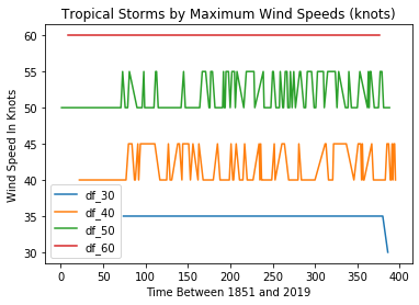
This can be helpful for confirming that we’re not making a mess of the data itself. Checking visually will show, for instance, that there was, indeed, only a single 30 knot event in our dataset and that it took place towards the end of our time frame in 2016. But it’s not a great way to show us changes in event frequency.
For that, we’ll look at the data held in each of our dataframes.
df_30['Date'].hist(bins=20)
df_40['Date'].hist(bins=20)
df_50['Date'].hist(bins=20)
df_60['Date'].hist(bins=20)
A quick glance through those four plots shows us fairly consistent event frequency through the 150 years or so of our data. Again, try it yourself using different numbers of bins to make sure we’re not missing some important trends.
You can find much more technology content by David Clinton through his website. In particular, you might enjoy his new book, Keeping Up: Backgrounders to all the big technology trends you can’t afford to ignore.